
All work

Redesign project · 2023

123 UNI: redesigning the way in

123 UNI helps students apply to universities abroad. The original app left people unsure what it was for and lost in the application steps. The redesign gives it a clear purpose from the first screen and a guided path through an application.

Role
UI / UX design
Platform
Mobile app
Type
Redesign of an existing app
Scope
Research, flow, onboarding, UI
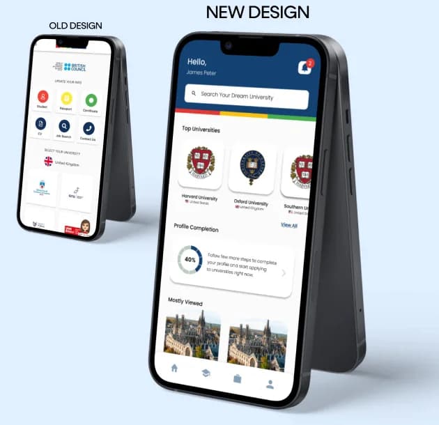
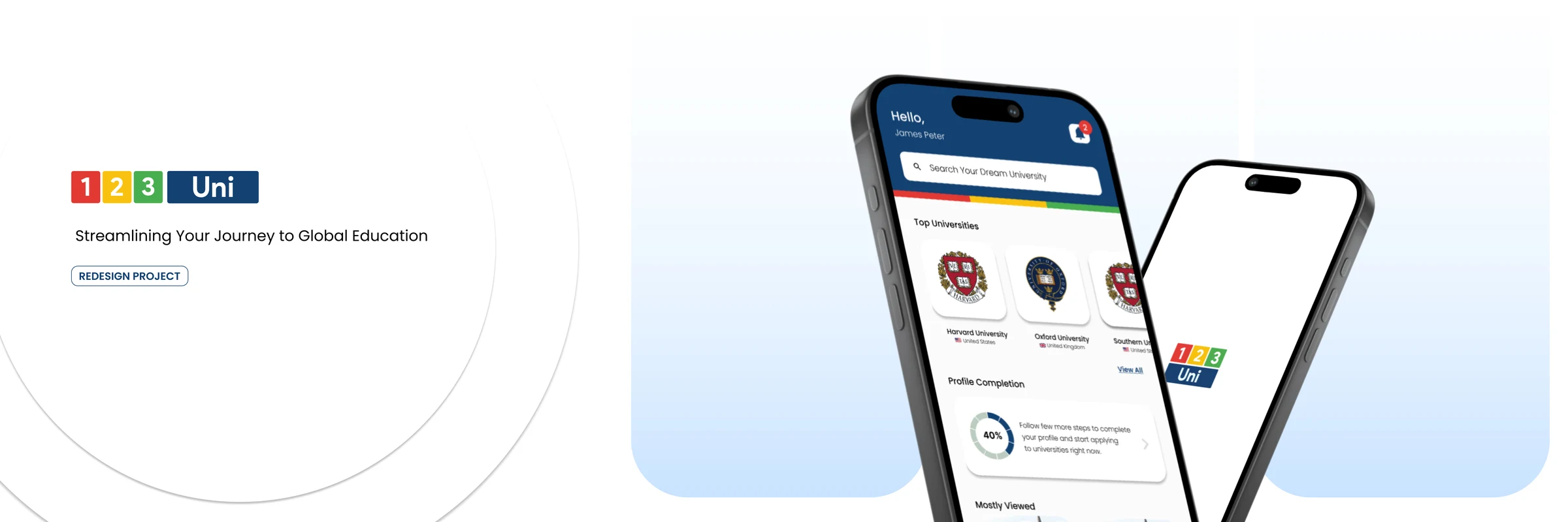
123 UNI redesign project, Streamlining your journey to global education: the new home screen on a phone

01The starting point

An app meant to make studying abroad more accessible was itself hard to understand and hard to use.

123 UNI is a mobile app that helps students through the process of applying to universities abroad. Its goal is to streamline the application process and make higher education more accessible worldwide.

The initial design had significant usability problems that got in the way of people understanding the app and staying with it. Four of them drove the redesign.

02Who it is for

User personas

Pramodya Benjamin

Undergraduate student, Kandy · 23

Studying for a bachelor's in computer science. Highly comfortable with apps and technology for education and personal organisation.

Goals

  • Find and apply to top technology master's programmes in the United States or Europe.
  • Keep track of application deadlines and requirements across universities.

Sunil Perera

High-school teacher, Colombo · 47

Holds a master's in education. Moderately comfortable with technology: uses it for work and keeps up with the essential apps for his children's education.

Goals

  • Help his daughter find a suitable, well-regarded art school in Europe.
  • Understand the financial and logistical implications of her studying abroad.

03The redesign

Four problems, four answers

Each problem in the previous design, and what the redesign does about it.

The old design beside the new one: a grid of unexplained icons replaced by a home screen with search, top universities and profile completion
  1. 01

    What the app is for

    Before

    People were unsure what the app was for from the first moment, which caused confusion at the outset.

    After

    A short series of onboarding screens states the app's value and walks new users through its features.

  2. 02

    Guidance through an application

    Before

    With no guidance on the steps, applying felt daunting and unclear.

    After

    The flow became a step-by-step guide, each step laid out with what to do next. Progress indicators and checklists show how far along you are, which reduces the feeling of being lost and adds a sense of achievement.

  3. 03

    Finding information

    Before

    Critical information was not readily available and not intuitive to find.

    After

    The structure was reworked so requirements, deadlines and programme information are prominent. Search gained filters and quick categories, and information is presented plainly.

  4. 04

    Reasons to come back

    Before

    The original app did not hold on to people: little engaging content and no clear guidance.

    After

    The home screen now features universities and top programmes. Notifications flag important dates, and a Favourites list lets people save and return to the universities and programmes they care about.

04The work

User flow

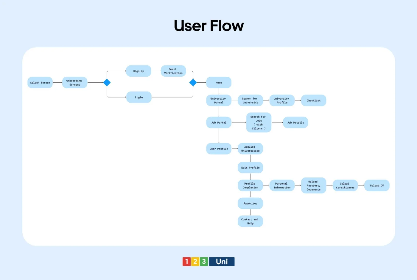
User flow: from splash and onboarding through sign-up to the home screen, university portal, job portal and profile completion

05The work

The redesigned app

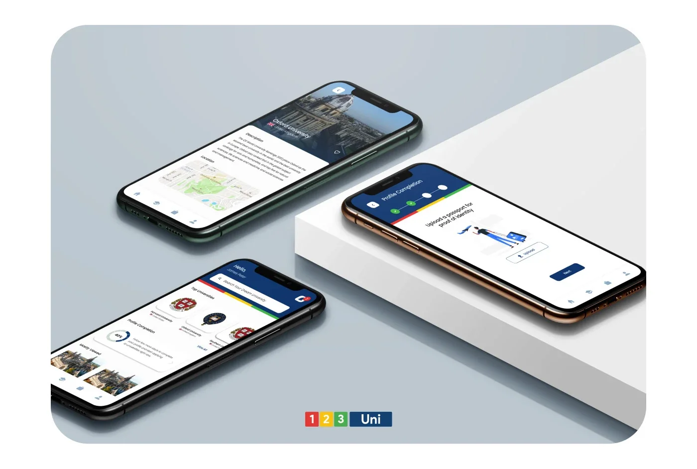
Three phones showing a university page, the passport upload step and the home screen
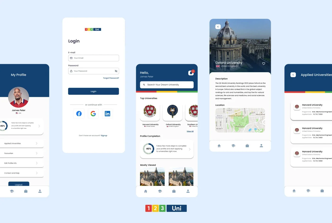
Screens: profile, login, home, a university page and applied universities
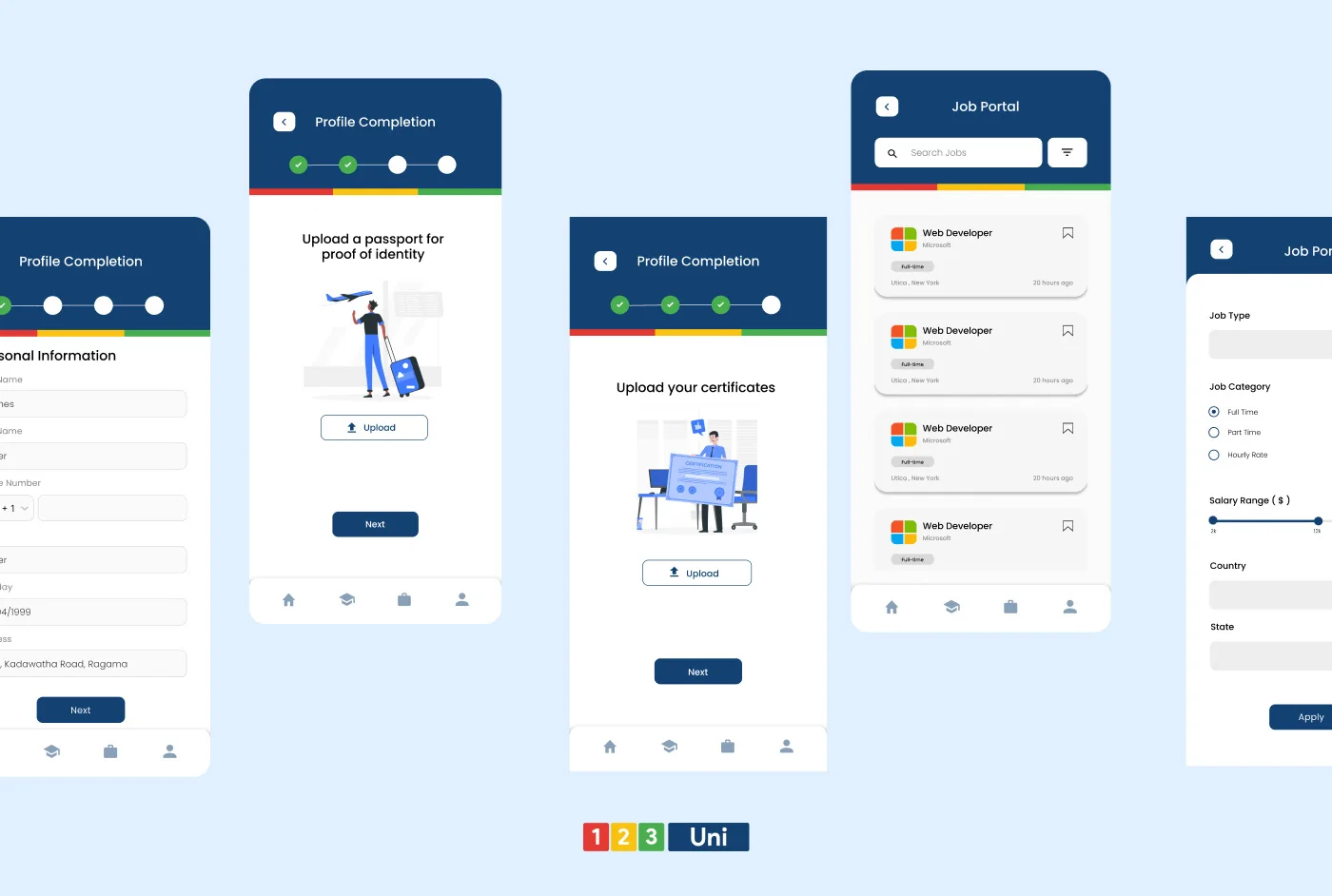
Screens: profile completion steps for identity and certificates, and the job portal with filters